7 Curated Gallery Wall Layout Rules Designers Secretly Follow
This site contains affiliate links. I may earn a commission at no extra cost to you.
Pinned those photos of a perfectly imperfect salon-style wall, but ended up with a patch of unnecessary nail holes? Recreating a curated gallery wall layout at home can quickly turn into a frustrating game of trial and error.
The secret isn’t magic; it’s methodology.
Mastering a few designer principles transforms a random jumble of frames into a dynamic, cohesive story. Here are 7 foundational rules pros use to plan a gallery wall layout that looks intentionally collected, not haphazardly hung.
Rule #1: Start with the Anchor, Not the Hammer
The biggest mistake DIYers make is starting in a corner and working outward. This creates a scattered, unfocused wall. A professional, curated gallery wall layout always begins with a strong anchor piece.
What Is an Anchor?
The anchor acts as the “sun” of your gallery wall system; it draws the eye first and sets the tone for surrounding frames. While often the largest piece, it simply needs to be the most visually dominant element on your wall.
- Oversized canvas: Feature bold colors or high-contrast art.
- Ornate mirror: Adds depth, reflects light, and breaks up flat glass.
- Textural element: Introduce woven baskets, wall sculptures, or macrame hangings.
- High-contrast photo: Use a dark, moody shot wrapped in a heavy frame.
Strategic Placement
Resist the urge to center your main piece directly in the middle of the wall, which can make the arrangement feel rigid.
- Shift off-center: Position the anchor slightly to the left or right of the wall’s horizontal midpoint.
- Vary the height: Move it slightly above or below standard eye level depending on your intended shape.
- Create an anchor block: If you lack one large piece, group 3 smaller frames tightly together (1 to 2 inches apart) to act as a single unit of visual weight.
By establishing a visual hierarchy first, you give the viewer a natural entry point. The eye lands on the anchor first, then seamlessly navigates outward across the rest of your wall.
Rule #2: Master the Art of Negative Space (The “Breathing Room”)
When a gallery wall feels “off,” inconsistent spacing is usually to blame. In a professionally curated gallery wall layout, the blank space between the frames carries as much weight as the artwork itself.
Negative space acts as the visual glue holding the composition together.
The 2–3 Inch Standard
Measure the gap between the edges of your frames, not their centers:
- Target distance: Maintain a strict 2 to 3-inch gap between every frame, regardless of size.
- Equal treatment: A 4×6 print and a 16×20 poster should share the same 2.5-inch border from their neighbors.
Consistency Over Symmetry
A curated wall does not require a mirror-image layout, but it does require uniform spacing.
- Avoid visual traps: Gaps that jump from 2 inches to 5 inches look like mistakes and derail the viewer’s eye.
- Create a smooth flow: A continuous “gutter” of white space guides the eye effortlessly across your entire curated gallery wall layout.
Quick Pro Tip
Cut a strip of cardboard or a wooden paint stirrer to exactly 2.5 inches wide. Hold this spacer block between frame edges while placing your marks to guarantee perfect gaps before hitting a nail.
Rule #3: Unify with a Common Denominator
A collection of mismatched pieces can quickly look like a clearance-bin display without a clear thread tying them together. The soul of a curated gallery wall layout is making disparate items look deliberately collected over time.
Choose Your Unifying Elements
Pick two specific commonalities to balance variety with high-end cohesion:
- Frame finish: Stick to a singular material or color, such as all thin black metal, raw oak, or ornate vintage gold.
- Matting style: Use uniform white mat boards across different frame types to create visual harmony and clean boundaries.
- Color palette: Limit art choices to a tight palette, such as black-and-white photography paired with sepia sketches.
- Subject matter: Group focused collections like architectural line drawings, botanical prints, or tonal portraits.
Avoid the “Mix and Match” Trap
Mixing styles brings character, but changing too many variables at once causes visual chaos.
- Limit variables: Avoid mixing contrasting frame materials, varied mat colors, and unrelated art styles all on one wall.
- Focus contrast on size: Maintain consistency in finishes and subject matter while varying frame dimensions to create dynamic depth.
- Apply the 2-Rule formula: Pair two key constants, like brass frames + black-and-white photography or white mats + botanical prints, for an effortlessly intentional display.
Rule #4: The Paper-First Method (Plan Before You Puncture)
The clear sign of an amateur wall display is a collection of patched nail holes. Professionals don’t guess; they template.
Before hitting a single nail into drywall, finalize your curated gallery wall layout using paper templates to guarantee perfect placement.
Step-by-Step Template Crafting
- Trace precisely: Lay each frame onto kraft paper or butcher paper and trace its exact outline.
- Cut out shapes: Cut along your pencil lines so each template matches its frame size.
- Mark hardware locations: Turn each frame over, measure the distance from the top edge to the sawtooth hook or wire, and mark that exact spot on your paper template with an “X”.
The Painter’s Tape Test
Secure your paper templates to the wall using low-tack painter’s tape to test your arrangement risk-free.
- Test spacing: Arrange templates using your anchor piece and 2-to-3-inch spacing guidelines.
- Evaluate perspectives: View the layout from multiple room angles and sitting positions.
- Live with it: Keep the paper up for 48 hours to observe how changing daylight affects the composition.
Direct-Through-Paper Hanging
Once your arrangement feels right, hammer your nail directly through the marked “X” on the paper template. Drive the nail in, tear the paper away, and hang your frame. Your curated gallery wall layout goes up with zero wasted drywall repairs.
Rule #5: Balance Visual Weight, Not Just Size
A common layout mistake is balancing large frames only with other large frames. True visual balance relies on visual weight: how heavy or light an object appears to the eye.
Understanding Visual Weight
A small, dark oil painting in a heavy mahogany frame carries high visual weight, while a larger, minimalist print in a thin silver frame feels light. Concentrating heavy elements on one side makes your curated gallery wall layout feel lopsided.
- Heavy elements: Thick frames, dark mats, high-contrast art, rich color palettes, and busy patterns.
- Light elements: Thin frames, wide white mats, pale watercolors, line art, and airy photography.
Balancing Strategies
Keep visual weight evenly distributed across your arrangement:
- The seesaw method: Balance a heavy piece on the left with either a similarly weighted piece on the right or a tight cluster of two medium-weight frames.
- Diagonal color distribution: Pair intense colors or dark tones across opposite diagonal corners to ground the overall display.
- Inward visual flow: Position subject matter with directional energy, like a portrait facing in profile or a moving landscape line, so it points into the center of the wall rather than off the edge.
Distributing color intensity and frame weight purposefully keeps your curated gallery wall layout visually stable and engaging from every angle.
Rule #6: Define the Boundary (Invisible Geometry)
A well-curated wall looks organic, but it is never accidental. Designer layouts align outer edges to build an invisible geometric shape, preventing a collection from looking cluttered.
1. The Organic Rectangle
The most popular layout for modern interiors, balancing structure with flexibility.
- Outer frame: Keep the overall perimeter of your collection roughly aligned to form a large rectangle or square.
- Inner arrangement: Mix frame sizes and orientations freely within those outer boundaries.
- Visual impact: Contains diverse artwork inside a clean footprint so the display functions like a single piece of wall furniture.
2. The Salon Style (Floor-to-Ceiling)
A classic gallery look that creates maximum dramatic impact.
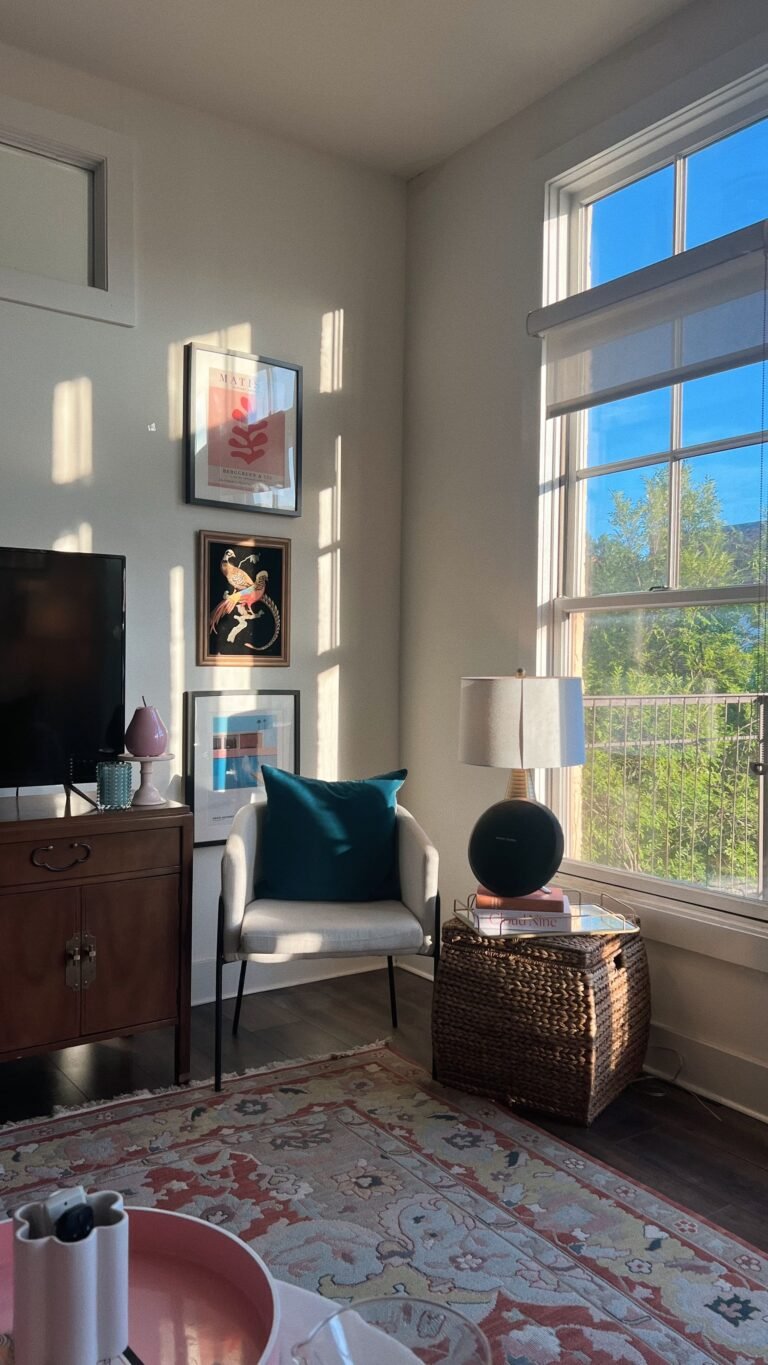
- Full commitment: Works best with extensive art collections that cover the wall from 8 inches above the sofa up toward the ceiling.
- Balanced silhouette: Keep frame spacing dense while avoiding large empty gaps or single frames jutting out unnaturally.
- Proportion check: Ensure your artwork fills the space comfortably so sparse arrangements don’t look lost on large walls.
3. The Strict Grid
A symmetrical choice for a clean, architectural finish.
- Matching elements: Use identical frame sizes, matching finishes, and uniform matting across every piece.
- Precision hanging: Align edges to the millimeter with uniform gaps between rows and columns.
- Best subject matter: Complements unified series like black-and-white portraiture, botanical prints, or architectural drawings.
Rule #7: Mix Media (Break the Frame)
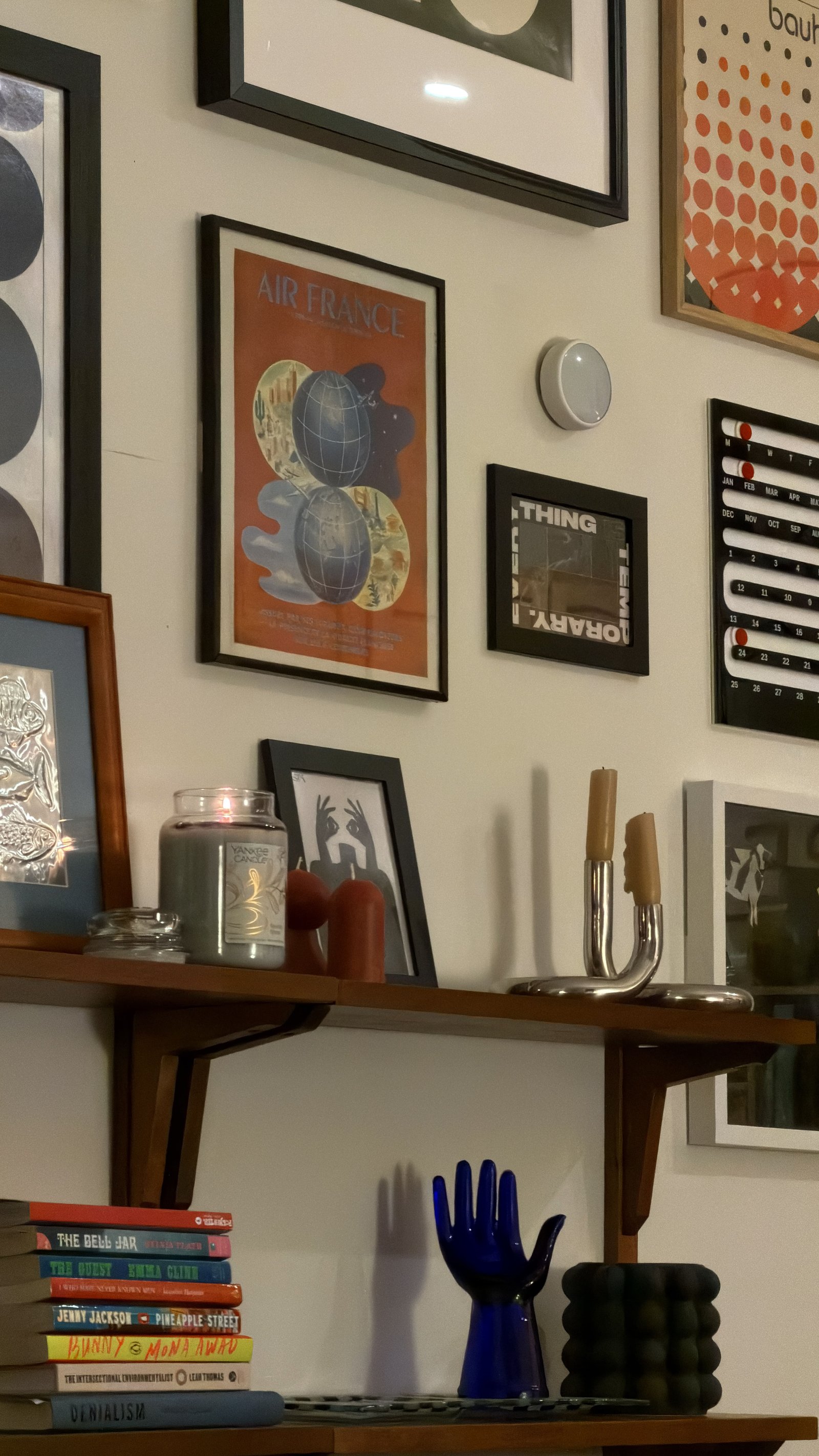
The highest level of a curated gallery wall layout breaks free from two-dimensional art. A truly collected display incorporates texture, physical depth, and varied materials to elevate your wall from a simple photo arrangement into a multi-layered installation.
Incorporate 3D Objects
Introduce non-traditional items to break up rigid frame edges and add dynamic visual interest:
- Wall sconces or picture lights: Add architectural dimension while highlighting key focal points.
- Hanging plants: Trailing greenery introduces organic shapes and living color that soften sharp lines.
- Woven baskets: Shallow wall baskets or chargers add warm, bohemian texture and natural warmth.
- Mirrors and clocks: Reflect light across the room and create functional visual breaks among flat prints.
- Sculptural accents: Small wall sculptures, decorative brackets, or carved wooden elements build physical depth.
The 80/20 Ratio
Keep your wall grounded as an art display rather than letting it look like a floating storage shelf:
- 80% framed 2D art: Traditional photographs, paintings, and paper prints make up the foundation.
- 20% 3D accents: Dimensional elements serve as intentional highlights, not the main attraction.
Maintaining this balance guarantees your curated gallery wall layout feels rich and textured without tipping into visual clutter.
Common Mistakes to Avoid
Even with the right guidelines, a few common pitfalls can undermine an otherwise great design. Keep these errors off your wall:
1. Hanging Too High
Hanging frames out of natural line-of-sight is the most common DIY mistake.
- The standard: Aim for the center of your overall curated gallery wall layout to sit 57 to 60 inches from the floor.
- Eye-level focus: Treat the wall as a single collective piece of art centered at average eye level.
2. The “Floating Island” Problem
Art placed without connection to nearby furniture creates awkward vertical gaps.
- Anchor to furniture: Position the bottom edge of your lowest frames roughly 6 to 8 inches above the back of a sofa, console table, or headboard.
- Maintain relation: Keep artwork tied to the furniture beneath it so the room feels cohesive rather than disconnected.
3. Sticking to Single-Sized Frames
Using identical small frames across a whole display often looks timid and flat.
- Vary scale: Combine large anchor prints (16×20 or 24×36) with medium and small accent pieces.
- Build contrast: Scale variation creates depth and guides how the eye navigates the arrangement.
4. Overlooking Lighting
Even a flawless arrangement loses impact without proper illumination.
- Highlight artwork: Install battery-operated picture lights, directional ceiling spots, or plug-in sconces.
- Brighten dark zones: Ensure hallway walls or low-light nooks have dedicated lighting to showcase fine details and color tones.
Conclusion & Final Checklist
Creating a stunning curated gallery wall layout is not about filling space; it’s about creating a dialogue between objects, memories, and textures that reflects your personal style.
Don’t rush the process. The planning phase – laying pieces on the floor, taping paper templates, testing natural light – is where the real magic happens.
Pre-Hang Checklist
Run through these quick checks before driving a single nail into drywall:
- Anchor defined: Identified a primary focal point or anchor block for the eye to land on first.
- Spacing consistent: Verified a uniform 2 to 3-inch gap between every frame edge using a spacer block.
- Template tested: Taped paper shapes to the wall and lived with the layout for at least 48 hours.
- Weight balanced: Distributed dark tones, heavy frames, and rich colors evenly across diagonal planes.
- Boundary checked: Aligned outer edges to form an intentional geometric shape like a rectangle or grid.
- Proportions set: Position the lower frame edges 6 to 8 inches above furniture or center the layout at eye level (57–60 inches from the floor).
Once your checklist is complete, grab your hammer with confidence and transform that blank wall into a personal masterpiece.