7 Neutral Home Decor Ideas With Personality (That Prove Beige Isn’t Boring)
This site contains affiliate links. I may earn a commission at no extra cost to you.
Looking for fresh neutral home decor ideas that don’t make your space feel cold, sterile, or like an untouchable Instagram set? You’re not alone. The secret to a soul-stirring neutral palette isn’t about avoiding color; it’s about mastering texture, contrast, and curated warmth.
The Problem with Standard Neutral Design
- The “Showroom” Trap: Stiff greige sofas, unlit candles, and untouched coffee table books.
- Lack of Soul: Blank canvases often end up feeling flat, sterile, and boring.
- The Color Misconception: People assume neutral means zero drama or personality.
How to Fix It
- Master Layering: A cream-on-cream room can beat a jewel-toned space when layered right.
- Inject Contrast: Combine soft creams with dark woods, vintage accents, and wrought iron.
- Focus on Texture: Swap flat paint and plain cotton for bouclé, raw linen, and woven jute.
Here are 7 rule-breaking neutral home decor ideas to flip the script on bland beige and turn your home into a cozy, elevated sanctuary.
The Foundation: Understanding the New “Neutral”
Before diving into styling secrets, we need to answer one key question: what is a neutral today?
The Evolution of the Palette
- The 2010s (“Millennial Grey”): Cool tones, silver hardware, and white marble. Minimalist, but emotionally cold.
- Today (“Warm Minimalism” & “Quiet Luxury”): Rich, soulful shades that prioritize depth, tactile warmth, and natural elements.
The Modern Neutral Spectrum
- Warm Undertones: Cream, ivory, sand, camel, and terracotta.
- Cool Undertones: Greige, taupe, sage, and stone.
- The Anchors: Charcoal, espresso, soft black, and deep oxblood.
The Stylist Secret: The 60-30-10 Rule
To keep a room from feeling flat, create contrast in value (lightness vs. darkness) rather than just hue (color):
- 60% Dominant Neutral: The main base covering walls, sectional sofas, or primary flooring (e.g., warm white, light sand).
- 30% Secondary Contrast: Mid-tone elements like area rugs, accent chairs, or drapery (e.g., mid-tone oak, textured taupe linen).
- 10% The Anchor: The “exclamation point” accents like black lampshades, dark pottery, or wrought iron.
With this foundation set, let’s jump straight into the 7 rule-breaking design moves that bring a neutral room to life.
1. The Sculptural Statement: Form Over Hue
When you strip away color, the eye immediately looks for something else to grab onto: shape. In a colorful room, a boring sofa hides behind vibrant accent pillows. In a neutral room, a boring sofa is just a boring sofa.
That’s why high-end neutral home decor ideas rely heavily on furniture that doubles as functional art.
Why Form Matters
- Replaces Color: Dramatic silhouettes and curves create visual interest without visual clutter.
- Adds Architectural Depth: Unexpected shapes draw the eye across the space, creating natural focal points.
- Eliminates the “Bland” Effect: Unique contours keep monochrome rooms from feeling flat or repetitive.
How to Execute It
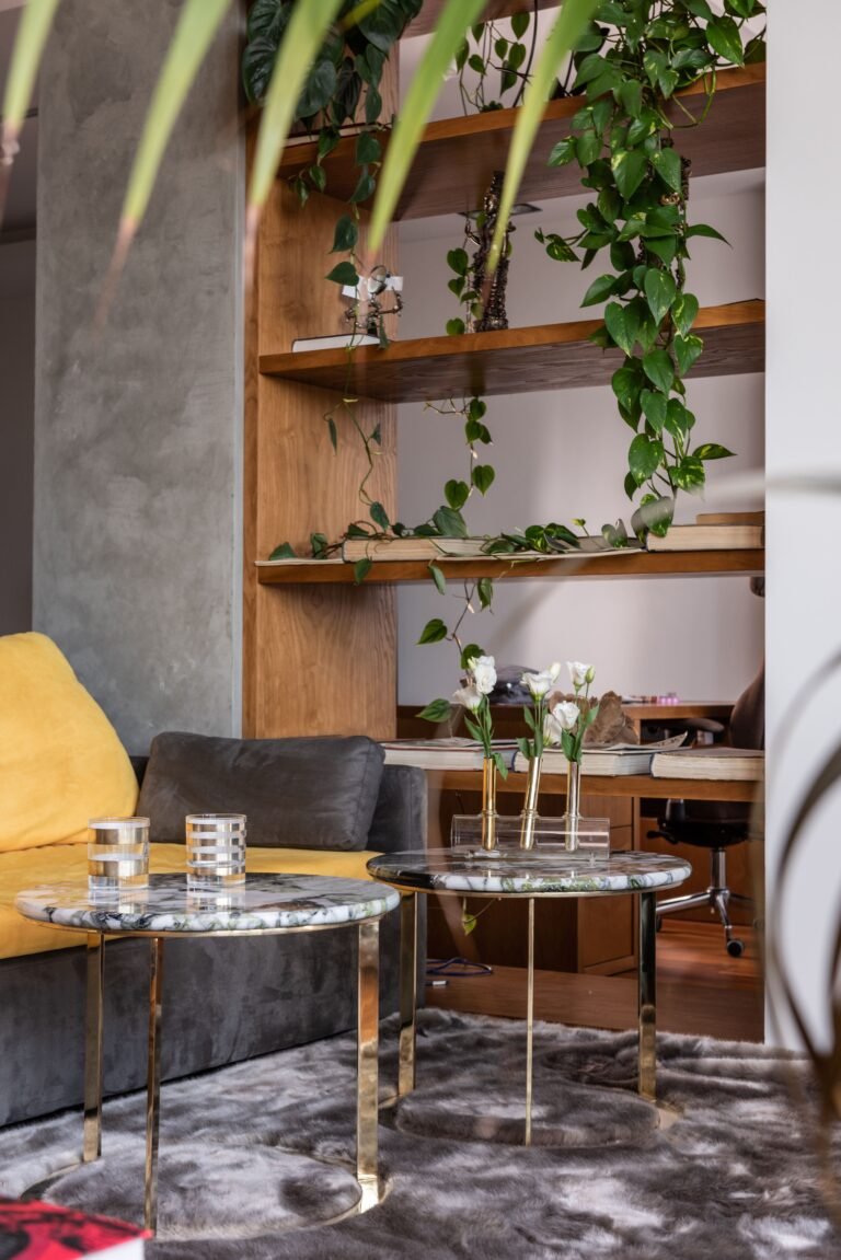
- Swap the Coffee Table: Pass on standard rectangular wood tables in favor of a chunky travertine plinth or rounded plaster nesting tables.
- Choose Curved Seating: Replace boxy armchairs with a barrel-back chair in a nubby bouclé fabric.
- Play with Organic Accents: Place a twisted wood stump side table next to an ultra-sleek sofa to create dynamic visual tension.
The Golden Rule
If it isn’t comfortable, make it sculptural. If it isn’t sculptural, make it textured. If it’s neither, hide it in a closet.
2. Texture Tapestry: The “Feel” Factor
If you take only one piece of advice from this list, let it be this: texture is the new color. A room without color contrast must have tactile contrast to survive. This hidden secret, known in design circles as “layering”, is what makes beige rooms look high-end rather than forgotten.
Why Texture Matters
- Replaces Visual Noise: Softens monochrome spaces without needing busy patterns.
- Adds Immediate Depth: Prevents a light palette from looking flat under direct lighting.
- Creates a Lived-In Sanctuary: Makes your home feel curated over time, avoiding the “room-in-a-box” look.
How to Mix Opposites
- Hard vs. Soft: Pair a rough-hewn reclaimed oak bench with a cloud-like shearling throw.
- Shiny vs. Matte: Match polished nickel or unlacquered brass lamps with raw, unglazed ceramic vases.
- Woven vs. Smooth: Layer a chunky wool rug over wide-plank wood flooring or polished concrete.
The Stylist Rule for Fabrics
Don’t fear mixing 5+ fabrics in one seating zone. Linen drapes, leather seating, velvet pillows, jute rug base, and raw silk shades coexist effortlessly as long as they share warm undertones.
3. The “Almost Black” Accent: The Puppeteer
It sounds counterintuitive, but adding black is the fastest way to save a “light and airy” room from looking washed out. Think of dark accents as visual punctuation; they ground the space and, paradoxically, make your creams and beiges look brighter and cleaner.
Why Dark Accents Work
- Provides Visual Weight: Creates an anchor for the eye so the space doesn’t feel like it’s floating away.
- Sharpens the Silhouettes: Outlines curves and architectural lines that would otherwise blend into white walls.
- Boosts Contrast: Gives the surrounding light tones something strong to push against.
How to Apply the “Punctuation” Rule
- Slender Lighting: Place a thin, black-framed arch lamp over a light cream sectional.
- Legs and Frames: Opt for chairs or tables with slender espresso or black metal legs.
- Curated Objects: Add a single dark ceramic vessel atop a stack of light-colored books.
- Crisp Artwork: Frame minimal art in thin, dark wood or charcoal borders.
The Stylist Secret
Without dark accents, a neutral room feels blurry. A few touches of charcoal, espresso, or matte black bring the entire design into sharp, intentional focus.
4. The Gallery Wall of Textures (Not Just Prints)
We have been conditioned to think that empty walls need to be filled with colorful flat art. But in a neutral room, the most compelling wall decor focuses on physical dimension and shadow play.
Mixing tactile, sculptural items breaks the standard rules of what a gallery wall should be, transforming your wall into a dynamic multi-material canvas.
Why Dimensional Walls Work
- Solves Blank-Wall Syndrome: Fills large vertical spaces without introducing chaotic visual noise.
- Leverages Natural Light: Plaster, fiber, and metal create constantly shifting shadows throughout the day.
- Delivers a Curated Feel: Looks like a collection gathered over time rather than a generic store-bought art set.
How to Execute the Look
- Fiber Art: Hang a woven macrame piece or heavy wool tapestry to soften hard architectural lines.
- Sculptural Plaster: Add a plaster bas-relief panel to introduce subtle relief and shadow.
- Reflective Accents: Integrate a vintage brass or unlacquered metal mirror to bounce natural light across the space.
- Minimalist Canvas: Pair textured pieces with a raw, stretched canvas carrying a single charcoal line drawing.
- Carved Objects: Display wooden bead garlands or carved wooden artifacts hung vertically for unexpected warmth.
The Stylist Secret
By focusing on materials rather than high-contrast images, you solve the empty wall problem while keeping your home quiet, calm, and deeply intentional.
5. Warm Wood Tones: The Backbone of Life
If you pair beige walls with a cream sofa and fill the room with grey-toned “driftwood” furniture, your space will look flat and lifeless. Wood is the ultimate secret weapon in high-end neutral home decor ideas; it brings the outdoors in and instantly infuses organic warmth.
To elevate a neutral palette, stick strictly to woods with high natural heat: golden, honey, or deep espresso undertones.
Why Wood Tones Are Essential
- Injects Natural Heat: Prevents all-white and cream rooms from feeling clinical or washed out.
- Adds Timeless History: Introduces rich character that synthetic materials simply cannot replicate.
- Grounds Soft Fabrics: Connects light upholstery to the physical architecture of the room.
How to Choose Your Woods
- White Oak: A go-to designer staple offering durable strength and a warm, golden glow.
- Walnut: Richer and darker, perfect for channeling an elevated “Quiet Luxury” atmosphere.
- Teak or Mahogany: Ideal for vintage statement pieces, bringing a reddish depth that pops against cream walls.
How to Style It
- Live-Edge Consoles: Position a heavy wood console against a smooth plaster wall for instant architectural drama.
- Vintage Framing: Display dark walnut frames on floating shelves to build subtle, layered history.
The Stylist Secret
Wood isn’t just a surface; it’s a story. It anchors soft upholstery to the natural world outside your window.
6. Organic Imperfection: The Wabi-Sabi Effect
Showrooms feel cold because everything is perfectly aligned, symmetrical, and pristine. A true home is wonderfully imperfect. To make a neutral palette feel soulful rather than sterile, embrace the Japanese philosophy of Wabi-Sabi, finding beauty in age, asymmetry, and natural wear.
Why Wabi-Sabi Works
- Breaks Rigidity: Replaces stiff, manufactured symmetry with natural fluidity.
- Invites Comfort: Signifies a lived-in space where guests can actually relax.
- Elevates Simple Objects: Turns everyday raw materials into captivating design moments.
How to Execute It
- Asymmetrical Ceramics: Choose vases featuring pitted surfaces, drippy glazes, or uneven rims.
- Unsteamed Linen: Let your linen curtains wrinkle naturally to maximize tactile texture.
- Gnarled Botanicals: Swap uniform grocery flowers for dramatic, twisted branches placed in a stoneware crock.
- Relaxed Shelf Styling: Stack books both vertically and horizontally, topping them with raw river stones or natural coral.
The Stylist Secret
Perfection feels clinical. Embracing small imperfections adds a layer of quiet authenticity that makes your space feel human, grounded, and welcoming.
7. The “Unexpected” Neutral Hue: Greens, Browns, and Pinks
You don’t have to limit yourself strictly to white, ivory, and beige to keep a space neutral. Non-traditional neutrals – heavily desaturated, muted tones – deliver the same calming foundation as beige while injecting subtle warmth and personality.
Why Muted Hues Work
- Adds Emotional Depth: Elevates a quiet room without creating visual clutter or chaos.
- Reflects Nature: Mirrors organic landscapes like forest floors, sun-baked clay, and dusk skies.
- Bridges Color and Quiet: Satisfies the desire for color while preserving a serene atmosphere.
How to Choose Your Hue
- Muddy Olive Green: Functions as a restorative, grounding tone (e.g., olive velvet accent seating in an all-cream space).
- Dusty Terracotta or Clay: Delivers earthy, sun-baked richness (e.g., raw terracotta pottery or soft clay-toned cushions).
- Dusty Rose or Blush: Offers a sophisticated, skin-like glow (e.g., muted blush linen lampshades or woven throws).
The Stylist Secret
By using heavily muted tones, you trick the eye into sensing color while keeping the overall space cohesive, peaceful, and balanced.
Common Mistakes to Avoid (The “Don’ts” of Neutral Decor)
Avoid these common styling traps that separate a captivating, high-end room from a flat, boring one:
- Don’t match everything perfectly: Matching your walls, sofa, rug, and pillows in the same shade of beige creates a visual desert. Ensure variation in value (lightness vs. darkness) throughout the space.
- Don’t skimp on lighting: Neutral rooms rely entirely on soft shadows to highlight subtle textures. A single harsh overhead fixture flattens the entire design. Use warm 2700K bulbs across ambient floor lamps, functional table lighting, and accent candles.
- Don’t forget the “White Space”: Removing color doesn’t mean you need to fill every corner with clutter. Allow the architecture to breathe, an empty corner featuring a single sculptural chair carries far more power than a space crammed with artificial plants and baskets.
Conclusion: It’s a Vibe, Not a Color Scheme
Creating a neutral room with personality isn’t an accident; it is a curated expression of restraint. It is the design equivalent of a deep breath.
We have moved past the era of the cold, sterile showroom. The best neutral home decor ideas aren’t about avoiding color; they are about building a warm, grounding sanctuary. They communicate quiet confidence: calm, interesting, and full of story.
Key Design Takeaways
- Prioritize Form: Lean on sculptural shapes when color is absent.
- Master Tactile Depth: Rely on rich, mixed textures to create dynamic contrast.
- Anchor with Heat: Choose warm undertones and dark accents to keep spaces grounded.
How to Start Styling Today
- Swap Textiles: Ditch cool-toned throws for a chunky oatmeal wool or raw linen blanket.
- Update Accents: Replace plain glass vases with pitted, rough clay pottery.
- Introduce Tension: Add a single dark, sculptural piece of furniture to sharpen the entire palette.
Build your “anti-boring” sanctuary one layer at a time; you’ll quickly discover that a room without bright colors can still be overflowing with life.