7 Bookshelf Decorating Mistakes Designers Always Spot (and How to Fix Them Fast)
This site contains affiliate links. I may earn a commission at no extra cost to you.
Fixing common bookshelf decorating mistakes doesn’t require buying new decor; it just takes a smarter layout. You’ve bought the books, vases, and candles, yet something still feels off:
- Too cluttered? The shelf feels heavy and chaotic.
- Too sterile? The display looks like a showroom, not a home.
- Too empty? The items feel lost and disconnected.
Having all the right ingredients but ending up with a visual mess is one of the most frustrating feelings in home decor. But before you tear everything down, take a deep breath.
The Real Issue
The problem isn’t the items you own; it’s how they interact. You are likely committing a few common traps interior designers spot instantly:
- The “Rainbow Shelf” Trap: Sorting purely by color wipes out natural texture.
- The “Police Lineup” Error: Aligning everything to the front edge creates a flat, rigid look.
- The Space Crunch: Ignoring negative space suffocates your display.
- The Missing Spark: Forgetting organic elements leaves shelves feeling lifeless.
The Fix
- Cost: $0 (no new buying required)
- Time: Under 30 minutes
- Goal: Stop the visual noise and curate a shelf that breathes
Let’s break down these common pitfalls and how to fix them today.
Mistake #1: The “Front-Edge” Alignment (The Sterile Line)
Look at your bookcase from the side:
- Are all your books and objects pushed flush against the front edge?
- Is the back of the shelf an empty, dusty void?
If so, you’ve created the “Retail Display” effect, a classic among bookshelf decorating mistakes. While alignment works for bookstores, it leaves a home feeling sterile and two-dimensional.
The Problem: Flattening Your Depth
- Kills the 3D effect: Aligning everything to the front turns a deep box into a flat wall.
- Stops eye movement: The harsh, vertical line offers no visual intrigue.
- Eliminates shadows: You lose natural light play, layering, and dimension.
The Fix: The “Push-Pull” Method
Instead of a wall, create a varied landscape:
- Push Back: Move select books all the way to the back panel of the shelf.
- Pull Forward: Bring specific decorative objects or book stacks toward the front lip.
- Layer Up: Place a small framed print or decorative plate behind a forward-facing stack of books.
Why It Works
The gap between the back wall and your front-focused items creates natural shadow lines. These subtle shadows are what the human eye interprets as “depth,” “warmth,” and “luxury.”
The Takeaway
Flatness isn’t neatness. Breaking this habit is the fastest way to correct your bookshelf decorating mistakes and give your shelving an architectural, high-end look.
Mistake #2: The “Matchy-Matchy” Height Syndrome
Look at the tops of your vases, frames, and candles:
- Draw an imaginary line: Do your accessories all end at the exact same level?
- Check the rhythm: Does the arrangement feel monotonous or stiff?
If so, you’ve hit the “Flatline”, one of the sneakiest bookshelf decorating mistakes. Equalizing heights feels organized, but it robs your display of movement and energy.
The Problem: Zero Rhythm
- Creates visual monotony: The eye sweeps across without finding a focal point.
- Feels rigid: Beautiful individual items look boring when forced into a single line.
- Ignores natural variation: Great decor mirrors nature, which thrives on peaks and valleys.
The Fix: The “Triangle Theory”
Group items using contrast and odd numbers:
- Use the Rule of Three: Cluster objects in groups of three (Tall, Medium, Short) to form a visual triangle.
- Stack books as pedestals: Turn horizontal hardcovers into risers to lift short candles or small sculptures.
- Mix shapes and scales: Pair a tall, slim vase next to a low, wide bowl.
- Anchor with background art: Lean a tall frame against the back wall to serve as your highest peak.
The Takeaway
Stop equalizing your decor. Adding height variation is one of the easiest ways to resolve bookshelf decorating mistakes and inject natural rhythm into your room.
Mistake #3: The “Rainbow Trap” (Over-Colorization)
Arranging books strictly by color was once the ultimate trend. However, in real homes, the “rainbow shelf” is often a trap.
- Does your shelf look chaotic? Your eyes jump frantically between heavy blocks of red, yellow, and blue.
- Do your books feel fake? Turning books into blocks of pigment strips away their character.
Over-colorizing is one of the subtle bookshelf decorating mistakes that make a space feel unsophisticated rather than curated.
The Problem: Visual Noise
- Shatters flow: Harsh blocks of contrasting color create constant visual interruptions.
- Kills texture: Strict color-coding erases the natural, organic warmth of varied book spines.
- Feels unnatural: It turns a personal library into a rigid display exhibit.
The Fix: Palette Restraint or Texture Focus
- Limit your colors: If you love color-coding, restrict your layout to two or three cohesive shades (like creams, tans, and soft blues).
- Organize naturally: Group books by subject matter, size, or author instead of spine shade.
- Let accents carry color: Keep book spines relaxed, then introduce bold pops of color through targeted accessories—a vibrant vase, colorful art, or decorative bowls.
The Takeaway
Don’t fall into the Crayola box trap. Fixing color-based bookshelf decorating mistakes comes down to balancing natural textures with a controlled, intentional color scheme.
Mistake #4: Suffocating the Negative Space
Packing every square inch of your shelf with books, knick-knacks, and clutter turns a display into visual noise.
- Does the room feel small? Packed shelves add unnecessary visual weight.
- Are your eyes exhausted? Without empty areas, there is no place for the eye to rest.
Overcrowding is one of the most physically heavy bookshelf decorating mistakes you can make.
The Problem: Lack of Breathing Room
- Erases focal points: When everything is on display, nothing stands out.
- Adds visual chaos: Solid walls of items make an entire room feel chaotic and cramped.
- Feels unintentional: Overflowing shelves look like storage, not styling.
The Fix: The 60/40 Rule
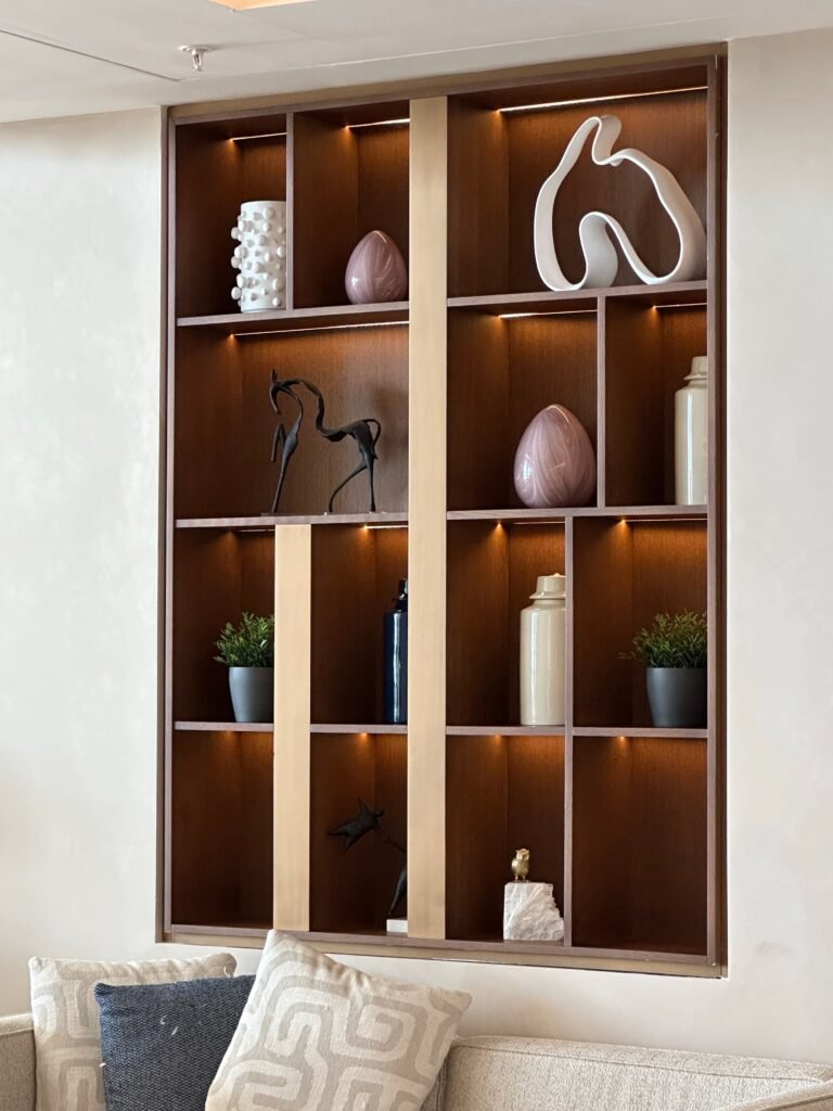
Aim to fill 60% of your shelf with decor and leave 40% completely empty:
- Edit ruthlessly: Remove damaged books you’ll never read and trinkets without meaning.
- Leave empty gaps: Create deliberate breathing room between book clusters.
- Highlight single items: Dedicate a portion of a shelf to just one striking bowl or a single low stack.
The Takeaway
Empty area isn’t wasted space; it’s active design. Correcting space-related bookshelf decorating mistakes by allowing “air” makes your shelving look curated, expensive, and intentional.
Mistake #5: The “Dead Zone” (Lack of Organic Material)
Scan your shelf materials: paper, glass, metal, plastic.
- Too rigid? Hard, manufactured surfaces make a shelf feel stiff.
- Too cold? A lack of natural textures creates a sterile environment.
Skipping living elements is one of the quickest bookshelf decorating mistakes to turn a cozy room into a corporate lobby.
The Problem: Man-Made Overload
- Feels unnatural: Spaces devoid of nature trigger a subconscious feeling of coldness.
- Lacks softness: Manufactured materials offer no warm, touchable texture.
- Emphasizes hard lines: Rigid shelves need natural, fluid shapes to soften their edges.
The Fix: Inject Life
Add at least one organic element to every major section of your shelf:
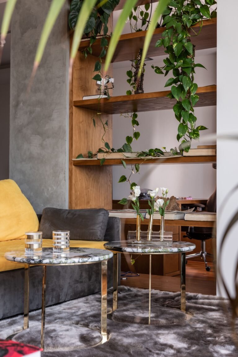
- Live Plants: A trailing Pothos or Philodendron breaks up hard horizontal lines as it cascades downward.
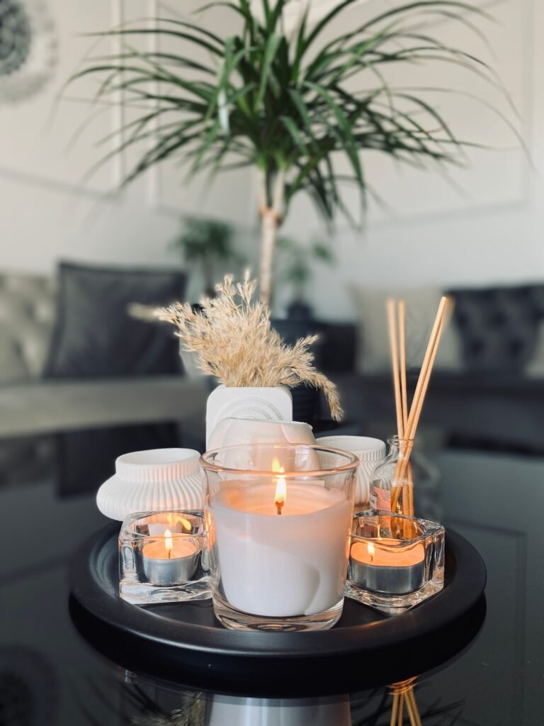
- Dried Botanicals: Use low-maintenance alternatives like dried eucalyptus, pampas grass, or a single sculptural branch in a stoneware vase.
- Natural Textures: Incorporate raw, earthy materials like woven wicker baskets, hand-carved wooden bowls, or rough crystals.
The Takeaway
Every shelf needs a touch of nature. Bringing organic elements into your layout is the fastest fix for bookshelf decorating mistakes that make a home feel lifeless.
Mistake #6: The “Row of Soldiers” (Book Stacking)
Look at how your books are arranged:
- All standing up? Books placed strictly side-by-side create a rigid, industrial wall.
- Filing cabinet feel? Uniform vertical lines make your space look like a library archive instead of a home.
Confusing strict library storage with intentional interior design is one of the most widespread bookshelf decorating mistakes.
The Problem: Rigid Monotony
- Kills visual rhythm: A unbroken line of vertical spines offers zero visual variety.
- Eliminates display space: Vertical books leave no flat surfaces for accents or layering.
- Creates a stark barrier: Long rows of upright books look stiff and heavy.
The Fix: The “Horizontal Break”
Interrupt continuous vertical lines by turning a portion of your books onto their sides:
- Apply the Rule of Thirds: Keep two-thirds of a shelf vertical and stack the remaining one-third horizontally.
- Alternate directions: Mix up your layout, try vertical books on the left, a horizontal stack in the middle, and vertical books on the right.
- Build mini-pedestals: Use horizontal stacks as risers to elevate small candles, decorative bowls, or trinkets.
The Takeaway
Flipping just 20% of your books onto their sides breaks up the monotony, adds multi-level contrast, and instantly resolves key bookshelf decorating mistakes.
Mistake #7: The Artwork Graveyard (Scale and Placement)
Look at how art and photos are placed on your shelf:
- Too many tiny frames? Scattering small 4×6 photos creates a “visual crumb” effect.
- Hidden pieces? Frames leaned flat against the back often get covered by books.
Mishandling scale and placement with art is one of the easiest bookshelf decorating mistakes to make, turning meaningful pieces into messy background clutter.
The Problem: Disappearing Scale
- Loses impact: Small items get swallowed up when placed next to large books.
- Adds clutter: Multiple tiny frames create chaos rather than an intentional focal point.
- Creates detachment: Art hung too high above a bookcase feels disconnected from the furniture below.
The Fix: The “Anchor Method”
- Go Big (Use an Anchor): Lean an oversized framed print or canvas that fills at least one-third of the shelf height. Layer smaller frames in front of it to build depth.
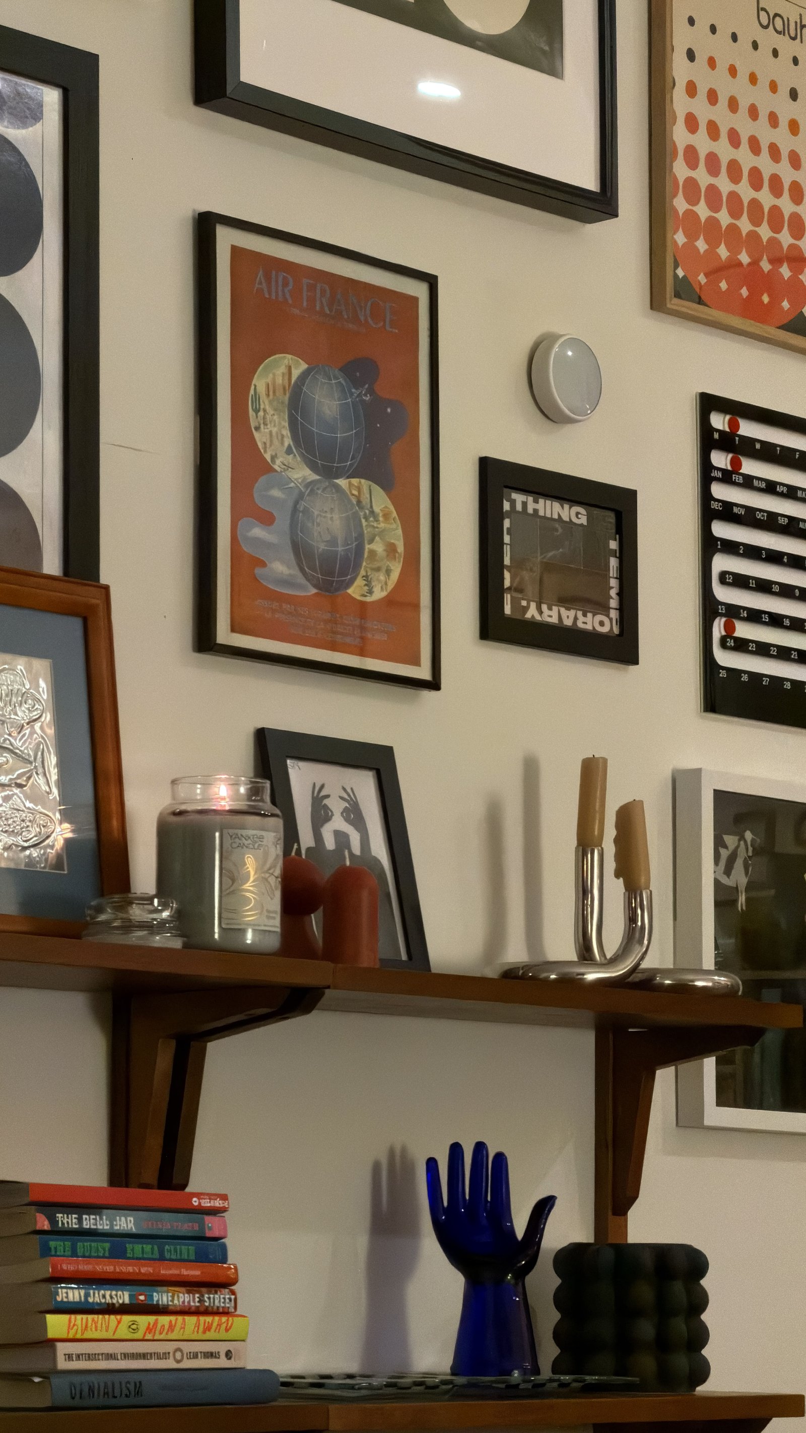
- Elevate Small Frames: Place smaller photos on top of horizontal book stacks so they peek out over upright spines instead of getting hidden.
- Connect Wall Art: If hanging artwork above the bookshelf, leave only 4 to 6 inches of space between the frame and the top shelf to keep them visually linked.
The Takeaway
Treat artwork as a bold anchor rather than a tiny garnish. Fixing scale-related bookshelf decorating mistakes turns random frames into a cohesive, high-impact display.
The “Weekend Reset” Checklist
Ready to fix these errors? Eliminate all seven bookshelf decorating mistakes in a single afternoon with this quick-action plan:
- 1. Clear the Decks: Remove every single item from the unit and wipe down the surfaces.
- 2. Categorize: Sort items into four clean piles: Books, Large Anchors, Small Accents, and Organic Materials.
- 3. Place Big Stuff First: Position oversized art, large baskets, and heavy sculptural bowls to anchor the space.
- 4. Add the Books: Mix vertical rows with horizontal stacks. Push some items back and pull others forward for depth.
- 5. Layer Small Accessories: Group small frames and candles in sets of three (Tall, Medium, Short) using books as pedestals.
- 6. Inject Life: Ensure at least one plant, dried botanical, or wooden piece sits on every single shelf level.
- 7. Step Back & Squint: View the shelf from across the room. Check for visual balance, negative space, and natural shadow lines.
- 8. Fine-Tune: Make minor layout tweaks until the display feels balanced and effortless.
The Takeaway
Mastering your decor doesn’t require buying expensive new accents. By avoiding common bookshelf decorating mistakes and focusing on scale, layering, and negative space, you can transform chaotic shelves into a curated, magazine-worthy feature.
Conclusion
Styling a bookshelf is an evolving practice, not a one-time setup. As you acquire new treasures, your displays should adapt. Creating a high-end look doesn’t require a massive budget; it just takes an understanding of visual weight, texture, and negative space.
- Check your layout: Are your items flattened to the front edge?
- Look for vitality: Is there organic life mixed into the hard materials?
- Verify breathing room: Is 40% of your shelf left intentionally open?
Your Next Steps
- Spot the traps: Use fresh eyes to identify which styling errors are holding back your room.
- Mix with intention: Blend styles freely while respecting scale, balance, and natural rhythm.
- Tell your story: Curate your items so your shelving reflects your personality rather than just holding storage.
Which of these traps have you fallen into? Drop a comment below to share your biggest styling challenge! If this guide helped you rethink your display, pin it to your Pinterest board for your next weekend project.